voir l'intérieur


Follow Me on Pinterest


Spilt Milk 

(mon blog photo)

pancartes Portfolio Tutorials papertoys Magic Sketchbook Free stuff Motifs de t'a moi Oizos! lapin!

Archives

Entries in Wise owl project (16)

Sunday
Nov242013

Sick days

Me and le Bu are sick  with a big cold and I am feeling a bit so-so, so we are having very slow days.

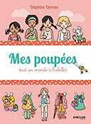
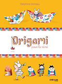
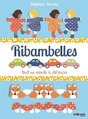
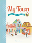
When I am in lazy mode, I love to set up cosily with my sketchbook and a cute book to work from. It's a good way to get inspired, a good and dreamy way. So I took a sweet Japanese craft book,Dōbutsu zuan ( Penguins! Embroidery! Soft Toys!) and grabbed a felt pen and one of these no-mess brushes with a reservoir to dilute the outline and create shadows. It's a fun and easy wait to paint, exactly what I needed for a lazy day.


Dōbutsu zuan
Dōbutsu zuan  Le Bu a un bout de grippe et je ne vaux pas tellement mieux. Nous avons pris nos quartiers dans ma chambre, et j'ai sorti les iPad et les crayons...Ce sera un dimanche paresseux. 
J'avais heureusement empruntés quelques livres à la bibliothèque, dont un que j'ai acheté ensuite parce qu'il me plait beaucoup ( avec des appliqués, des broderies et des peluches pas neu-neu, suivez le lien) .
J'ai donc pratiqué un de mes exercices préférés, qui consiste à s'inspirer du bouquin en en faisant mes trucs à moi ( c'est très large...n'achetez pas le livre pour un trouver des lapins) sur un carnet de croquis. J'ai pris un feutre de mon fils, de ceux qui sont lavables et qui donc se diluent à l'eau.  C'est un très bon exercice, je recommande , je dis ça si la Lutine passe par la, je crois qu'elle aimerait bien, et puis toi aussi Nat!
Donc je dessine avec le feutre selon ce qui me plait dans le livre, ensuite je digresse à ma sauce...Une fois que j'ai fait quelques croquis, je sors la brosse à reservoir ( un pinceau avec de l'eau ca le fait aussi, mais pas sur mon lit, merci) , et je fais les ombres en dilluants les traits de feutre. 
Il faut faire attention parce que ca peut devenir très mou très vite, il faut du bon papier bien épais. Comme les encres noires sont en fait des bleus, verts ou rouges très sombre, on obtient des ombres de couleur, c'est très amusant. J'aime bien le résultat, pas vous?
(le résultat est monochrome, j'ai bidouillé sur Photoshop pour ajouter le rouge et le jaune)


 Allez-hop, à vos crayons!

Friday
Jun282013

6 livres pour apprendre à dessiner en s'amusant

Here is a review about my favorite doodle books. I am afraid it's in French. But the books are international so please check them. I listed the ISBN and links lower in this post.

Revue : mes livres de dessin préférés from delphine doreau on Vimeo.


Les livres cités:

20 Ways to Draw a Tree and 44 Other Nifty Things from Nature, by Eloise Renouf
ISBN: 9781592538379,

20 Ways to Draw a Cat and 44 Other Awesome Animals, by Julia Kuo
ISBN: 9781592538386 , publisher : Quarry

-------

Illustration School: Let's Draw Plants and Small Creatures, by Sachiko Umoto
ISBN: 9781592536474 , publisher : Quarry Books

Les autres livres par Sachiko Umoto, ici

-------

Illustration au stylo à Bille, par Yoko Ganaha, titre Japonais : ボールペンでイラスト―ちいさなお絵描きレッスン帖 [単行本]  
ISBN-13: 978-4870319202

Et son autre livre, Croquis au Stylo à Bille ,  ボールペンでスケッチ [単行本(ソフトカバー)]
ISBN-13: 978-4870319844

-------

Au début de la video je parle d'Ed Emberley. Il a dessiné plusieurs méthodes de dessin très chouettes, dont "How to draw a world", qui s'adresse plus aux enfants.

Tous ces livres sont très clairs, sans texte ou avec très peu de texte, le language dans lequel ils sont publiés importe finalement très peu.

Tuesday
Aug212012

On Colors (3)

Find the whole series "On colors" here.

Here is how I began to study colors with my very own approach. I needed something more practical than rules defined by others for other uses than mine. I needed to find the equivalent of mixing colors on a palette, and to go through my own culture and gathered corpus of lovely picture.

I took my iPad , and a few color apps. I used successfully Palettes Pro and Adobe® Color Lava for Photoshop® and tested some others ...I liked Palette Pro because it can extract colors from a picture, and Color Lava is fun because I can use the colors in Photoshop via Wifi. It's not really practical but real fun in a happy geeky way.

So what I did first is take my favorite pictures ever and extract the colors I loved.

Here is a lovely illustration by Boutet de Monvel on Adobe Color Lava. Boutet de Monvel was a very well known French children illustrator in the first part of the 20th century. I love his pictures since I was a little girl. So it was a good place to start! 
For months I analyzed loved pictures and discovered two important things:

1.That 5 colors is enough to make a picture, but usually not enough. Most of my illustrations have more than 5 colors . I had to combine palettes or add colors.


2. That color analysis app are great tools, but they don't give you the proportions to use. Like, if there is a large amount of red in a picture and very little blue and yellow, you will still extract samples the same size. I don't find  it helps me choosing colors. I learned to make moodboards instead of palettes, so I could get the inspiration I needed. Colors is about proportions, contrast and accents. Pinterest is a great tool for color hunting : see what I gathered here.

I also used the application moodboards on my iPad. 
Here is a sample I made for you, so you can get an idea : of course I don't use my own pictures usually.


Because colors depend on language a lot I also made research on color names in both my languages : corail, Kelly green, puce...I also learned that translation doesn't work so well: Khaki is not the same color in French and English. I began to translate colors in different languages to google them and get even more ideas.

This is how I learned more about colors and how I use them my way. But that's a lot of work and studying. I understand more and I am able to understand even more by association. It was a long and pleasant way and I am still working on it. Learning teaches you to be curious and make your own conclusions, and in a world of preprocessed foods and informations it's a very good thing. 

But I also came up with a good, fast way to create interesting palettes, and I will tell you more about it next time!


Tuesday
Aug212012

On colors (2)

Find the whole series "On colors" here.

I studied colors for a long time. Working on forensic reconstruction of the face of Ramses the Second, I learned how Egyptians used colors  3 thousand years ago. I was intrigued because they used two set of colors : one, very restricted, for sacred stuff, and an expanded one, where they mixed colors , for more casual pictures. (follow links for pictures)

I also knew that parietal paintings found in Lascaux had mostly four colors : white red earth and black. I don't think it's because they didn't have any other colors. I think it was mostly because of symbolic meanings. The same kind of meanings you will find in medieval pictures, in pojagi or ukiyo-e. The system of colors we use for road signals and logos are still respecting the medieval rules of colors created for coat of arms. Colors are deeply embed in our culture.

It is easy to get on the other side of the color perception and consider only symbols. Meanings and symbols generated glorious and simple, beautiful pictures. You can drape yourself in color meanings and enjoy it tremendously.

Clutched between science and symbols, Goethe and Newton make me quite nervous. Their work on color is the basis of most that we know now, but both of their work is tainted with approximation and affirmations with no scientific basis whatsoever.   

I studied  for a long time. I also studied the fact that we don't really see or integrate a color before  we have a name for it. Like there is very little quotes of about blue in Occident literature before the 13th century, when suddenly blue became a very trendy color indeed.  We ourselves thrive by trends, and words like turquoise, tangerine , coral and the multiple names of browns bring different palettes to our lives. Language is actually a big part of our color world.

Studying gave me only one certitude : there is scientific rules for color production...But there is none for color use. Unless you consider the part of art that is giving yourself rules about what you are doing ( ex: I will do this in a square. I will use bright colors. I will use only crayons...etc) there is absolutely no rules. There is taste. There is culture. There is fashion. That's it. You can follow, or not : you are free.

Pick something you like. Work with colors you love. Chose your own rules. And break them too.

I remember that brown and navy blue together were out of question for me. I mix them happily now. I wouldn't squirm on an orange and khaki and pink picture now, but 20 years ago I would have found that disgusting. And I would be sorely disappointed now by the colors of my living room in 1992 : cream, grey-blue and pine wood, which I used to love to bits. 

So I took another approach.

(to be continued)

Saturday
Aug182012

On Colors

Find the whole series "On colors" here.

My dear  friend Lisa was wondering the other day how I chose my colors. She knows I am very much interested in the subject. From science to perception to language, sociology, and culture, it's not a light subject.

Most people are very happy with complementary colors...And are half wrong because they don't use the right color wheel.  Like, in the real world of perception, the complementary of blue is yellow, and red is turquoise. But whatever, because what is important is actually contrast and similar shades .


And then there is fashion (yes indeed for colors) and cultures . For example red is GOP here, socialist in France, and people live by the colors of their flags wherever they are. Except in Holland were they have another national color, orange...In bright lights like in LA people tend to like more vivid colors, in softer ones more subdued , like all shades of plums and grey in Paris , so you can't really define rules. Or you can define ones but they are very complicated. 


My grandmother Mamette explained me once a little trick : you put all your colors in a rainbow , chose 3 or more that stand close to each other, then one at the other side of the rainbow for accents. It always works. 

I do follow her advice . Then I added cultural palettes I met in my travels  and studies: the palette of the little pink  Battistero in Parma , red and pink combo seen in Japanese chiyogami, mix of yellow and fuchsia seen in Goa, the particularly delightful celadon green of the Pacific here when the sun backlit the waves...that kind of things. I created my very own palette, with my favorite blues, reds and greens, that worked together. It took me years!

But I realized recently that even if these were my favorite colors, and even if Mamette rules...I was still using the same colors, always . So I added colors from people I love : that lavender from Clo, this mustard yellow from Rachel, a bit of bright blue from my husband, green from my son...It's fun to think about them when I paint, but it's not enough, it's never enough.

So I took another step... I will post about it soon!


Pas de traduction...La dernière fois que j'ai posté à propos de couleurs, j'ai eu droit à plein de remarques très désagréables de la part de trolls Franchouillons qui ne savent pas que Newton a choisi 7 couleurs dans l'arc en ciel pour des raisons ésotériques ( c'est pas très scientifique ça), que Chevreul voulait surtout créer des teintes pour colorer du fil, que Itten est complètement dépassé et que la couleur est un problème de culture et de langage autant que de science. Si vous tenez absolument à expliquer à toute la planète que le vert est la complémentaire du rouge parceque c'est trop dur de remettre en question des règles difficilement acquises...Abstenez-vous de commenter et je ne sais pas moi...Allez regarder un feu rouge, fermez les yeux...Quelle couleur apparait?

Sunday
Sep042011

Oh no please don't!

Someone actually used on her website a pattern she cut out of one of my illustrations. It's a definitive no, no! I know I put here some patterns for you to use, but not all my patterns are for free use (and none is for free commercial use).

There's a few reasons for that. First, you should not cut pieces out of my art. Unless it's a cut out and paste piece, of course. It's not nice. I make pictures to be whole, and really don't appreciate when you cut them in pieces, or change the colors, or whatsoever. My art was done to be seen in a certain way, please don't alter it!

I also feel like I should be the first one to enjoy my own art. A pattern take hours to design, and I feel I deserve to be the first one to use my designs before putting my hard work to public use.

Then, the public versions are often watermarked, and smaller than the one I keep for me. It's not to annoy you. It's not because I'm mean. It's because some people think that since it's on the internet, it's free. When it's free, it's theirs. Since it's theirs they can sell it. Making money out of something that was done by someone else is stealing, free stuff or not. So the free versions are somewhat altered (not much) so I can prove they were stolen when seen somewhere else. Sorry for that, but I actually made more money 3 years ago out of suing mean artists who stole my art than from actual clients, it's an awful feeling and I don't want to go through this again.

Another reason, and please carefully read, is that, I live out of my art. Which means that sometimes, pictures  and patterns on my blog are sold to someone else. I always keep the possibility to use my own art...but I might be the only one except for my client. Which means that if you steal or use my art without authorization, you might be sued by one of my clients? Not by me. One of my clients. And  I won't be able to find an arrangement. I won't be able to do anything about it. Not a fun thought, for me and for you!

Anyway, here's the infamous cutout, prepared for you to use on non commercial art and backgrounds. Enjoy!


Quelqu'un a utilisé sur son site un motif qu'elle a littéralement coupé d'une de mes illustrations. Non, non, et non! Je sais que je mets ici quelques patterns pour votre usage perso, mais tous mes motifs ne sont pas d'usage libre ( et aucun d'usage commercial gratuit).

Il y a quelques raisons pour cela. Tout d'abord, vous ne devriez pas découper des morceaux de mes illustrations. Sauf si c'est un découpage à imprimer, bien sur. Mes images sont un tout, ça me choque que vous les coupiez en morceaux, ou changiez les couleurs, ou que ce soit d'autre. Mon art est fait pour être vu d'une certaine manière, s'il vous plaît ne  le modifiez pas!

J'aimerais bien aussi être la première et parfois la seule à profiter de mon dur labeur. C'est bien de partager, mais si je ne garde rien pour moi, je ne suis qu'une coque vide.

Ensuite, les versions publiques ont souvent mon nom en filigrane, et sont plus petites que celles que je garde pour moi. Ce n'est pas pour vous embêter. Ce n'est pas parce que je suis meuchante. C'est parce que certaines personnes pensent que, puisque c'est sur internet, c'est gratuit. Et quand c'est gratuit, c'est à elles.Et puisque c'est à elles, elles peuvent le vendre Faire de l'argent de quelque chose qui appartient à quelqu'un d'autre est un vol, image libre de droits ou non. Donc j'altère quelque peu les versions gratuites, pour pouvoir facilement prouver qu'elles ont été volées si nécessaire. Désolé pour ça, mais en fait j'ai fait plus d'argent il y a 3 ans en poursuivant des artistes  qui ont volé mon art qu'avec des clients réels, c'est un sentiment terrible et je ne veux pas passer par ça de nouveau.

Une autre raison, je vous invite  à lire attentivement, c'est que  je vis de mon art. Ce qui signifie que, parfois, des images et des motifs sur mon blog sont vendus à quelqu'un d'autre. Je garde toujours la possibilité d'utiliser mon propre art ... mais je peux être la seule exception de mon client. Ce qui signifie que si vous volez ou utilisez mon art sans autorisation, vous pourriez être poursuivi en justice par un de mes clients. Pas par moi. Un de mes clients. Et je ne serai pas en mesure de trouver un arrangement. Je ne pourrais rien y faire. Ce n'est pas une pensée agréable, pour moi et pour vous!

Quoi qu'il en soit, voici le motif dérobé, préparé pour vous. Usage personnel, non commercial seulement, merci!


Monday
Nov082010

But really ?Owls!

Someone found quite fun to download my owls, print them, and made photos. Which is quite OK (I mean, the print part). Then she posted them (not OK), they were noticed, and I finally found them on one of my favorite blogs with no mention of my name more than " some owls I found on the internet". And this is not OK at all. 

A link to my blog was added afterwards thanks to the lovely people at Ohdeedoh (not their fault, and how lovely they were in following up, thank you so much guys!), but I never really allowed the use of my work in the original post, and I would have loved to be asked for. And then I got the usual "I couldn't find your name or website or whatever I didn't know", fake apology, since  my name was watermarked on the picture the blogger used.  

Click on the picture to download a printable pdf


I had a bit of re-appropration to do, to have my owls back. I made myself some more owls, and made cute ornaments out of the illos, to enjoy them a bit before I find them again on someone else website. Which is not OK, by the way, unless you ASK FIRST.

And since I was at it , I thought that I could share my owls with you ! Print them, make ornaments, mobiles, put them on a string or print them on fabric, but please please please if you plan to show them on your website, name me as the author, add a link to my website, and be kind enough to tell me so I can gush and be happy you did.

Happy howlidays!

------------------------------


Pour vous raconter rapidement une longue histoire, ça y est, on me pompe ici aussi...Une bloggueuse a utilisé mes images, les a posté en deco sur des gateaux ( mes préférés en plus si c'est pas vache ça!) , elle a trouve ça chouette (haha) et a donc contacté un blog de design (un de mes préférés aussi, non, faut faire dans les grandes largeurs quand on y va)...Ou je les ai trouvés grace à une lectrice. Mon nom n'était pas cité, les filles du blog de design ont rectifié, elles sont adorables...Par contre la bloggueuse m'a sorti qu'elle n'avait pas trouvé mon nom...Celui qui était en signature sur l'image? Ha oui. Pfff. Du coup ca m'a énervée ( un peu) et au lieu de mettre des watermarks gros comme ma tete sur mes images, je vous ai pondu (haha) quelques hiboux de plus, histoire que vous en profitiez plus que les indélicats qui me pompent...Voila, à vos ciseaux, et gros bisous à tous mes gentils lecteurs, qui me préviennent quand ils voient mes images ailleurs, grace à vous je peux continuer :)


PS: I forgot to add a quick how to. Here we are:

Monday
Aug102009

Copyrights-End of the story

3 years ago, someone stole a picture from my website, and made children bed sheet, a logo, posters, stickers and cards out of it. A year ago I made prints out of the same illustration (mine!). That person threatened to sue me. I fought back my best, and today I had confirmation that she gave at least part of the money she made to UNICEF. I could have asked the money for myself, but I want that money to be extra useful after being stolen.

End of the story. I will continue on the Wise Owl project (read about it here and here) as much as possible. Being an artist is not about the public you can get or the money you can make. It's about being able to express yourself the best you can, enjoying it tremendously, and loving sharing it. Even if it's only about bunnies, it deserves a little respect.

Ditto:

Il ya 3 ans, quelqu'un a volé une illustration de mon site web, et fait des draps de lit, un logo, des affiches, des autocollants et des cartes avec. Il ya un an, j'ai fait des tirages de la même illustration (la mienne!). Cette personne a menacé de me poursuivre. Je me suis battu mon mieux, et aujourd'hui, j'ai eu la confirmation qu'elle a donné au moins une partie de l'argent qu'elle a fait pour l'UNICEF. Je pourrais avoir demandé l'argent pour moi, mais apres tout ca je voulais etre sure que cet argent serait super utile, tout de suite. J'etais trop degoutee.

Fin de l'histoire. Je vais continuer sur le Wise Owl Project (vous pouvez lire à ce sujet ici et ici), autant que possible. Être artiste ca n'est pas une question de fric (quoique, il faut manger ) ou de fan club. Il s'agit d'être capable de s'exprimer le mieux possible, d'aimer le faire, et d'aimer le partager. Et meme si ce qui en sort c'est seulement une poignee de lapinous, ça merite un peu de respect.