voir l'intérieur


Follow Me on Pinterest


Spilt Milk 

(mon blog photo)

pancartes Portfolio Tutorials papertoys Magic Sketchbook Free stuff Motifs de t'a moi Oizos! lapin!

Archives

Entries in Tutorials (52)

Saturday
Nov302013

Advent calendar 2013

I feel lazy this year, and wanted a very simple advent calendar.

I inspired myself from, yes, my very own book and created a simple paper chain. Isn't it fun?

Fold, cut, hide little gifts or fairy lights behind the windows. Done

You can make it in 5 minutes and go for hot cocoa. 

I might improve it a bit and create a background. Not sure. What do you think?


You can download the pdf here, and I put a video at the end of the post to show you how fast it goes!

I stopped at the 24. I need to do something special for the 25. Not sure what. I need to think about it!

 CLICK ON THE PICTURE TO DOWNLOAD

Moi, cette année, je n'ai le temps de rien, mais je veux tout quand meme! Je me suis inspirée de ha ben oui, mon propre livre :

Pour faire le calendrier de l'Avent le plus simple ( et le plus joli, allez) du monde.On plie, on coupe, c'est fini. 12 minutes pour tout faire. Plus facile... ça va être difficile. 

On met la ribambelle sur un meuble avec des cadeaux ou une guirlande de lumière derriere.
Je me demande si je ne vais pas ajouter un petit fond derriere les fenêtres, j'hésite, à votre avis?  En tous cas, il ne va que jusqu'au 24, pour le 25 il faut que je réfléchisse...

Ribambelle tutorial from delphine doreau on Vimeo.

Sunday
Jun162013

Shrink paper how to

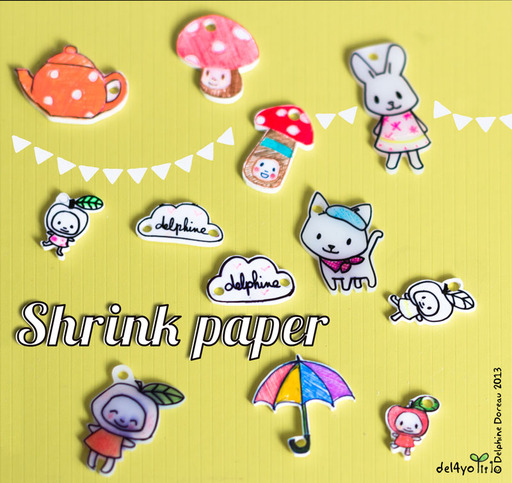
Getting it right with shrink paper is not that easy!

I had this idea in mind of cute shrink paper jewelry. Getting the process just right for wearable art was much more work than expected. I am actually still testing products and ideas.

I tested 3 kinds of paper from Grafix. The printable one would never flatten back after curling in the oven : maybe I got a lemon, but it's too expensive to make more tests. The translucent one did well but the result is not to my taste . The white one was exactly what I wanted but was very difficult to glaze or varnish.

I drew with classic Sharpies on the white grafix shrink paper, but Sharpie ink is NOT permanent on shrink paper. It looks ok. But after a while it melts on the skin or rubs off. It's  difficult to glaze because it is soluble with alcohol, acetone, and water. Most varnish have that kind of solvent. 

So I enquired around, with friend from many horizons, the stylists, the artists, the educators, the art store sales persons and the movie makers!

I ended up with a few solutions.


1.I you want a beautiful finish with an illustration like feel:

First sand your white shrink paper with a 400 grit sand paper to give it some tooth. There will be dust. Don't do this near any computer or electronic device.
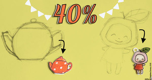
Draw with colored pencils ( Prismacolor work beautifully). Keep in mind that your drawing will shrink to 40% of its size or more so your colors will be 2.5 more concentrated, at minimum. Browns will be black, reds will be intense, etc. Cut out, don't forget to punch holes.  Shrink according to instructions.Then glaze or varnish with either Sculpey gloss for a shiny result or some artist acrylic medium ( the paste kind sold in tubes) for a more matte finish. 


I first sketched my drawings on paper then put the paper over it to copy. It's thin enough before shrinking that you can see through .

2.If you want a black outline and maybe some fun neon accents.

Don't use classic Sharpies, especially the black ones. If you still do, the only glazes I found that worked were white glue (it won't dry properly) and artist acrylic medium. Thing is, the acrylic medium doesn't dry pretty like a glaze and I find it frustrating. It's not a professional result. I tried to glaze over medium with Sculpey gloss but it's not perfect.

I tried oil paint based Sharpies with sanded paper. Not a good idea. The ink feathered. Yuck!

I tried the same oil markers on un-sanded paper, it worked! I added a few classic Sharpie neon accents because I noted they were doing better with glaze ( better, not perfect). I was afraid, since it's oil based, that it wouldn't cook very well, but it did OK. I can't vouch for fumes though. Maybe it's toxic, but with the very little amount of ink I used I thought it might be ok. The oil based Sharpie is not melting with glaze or acrylic medium, and if not glazed doesn't rub off as fast as the classic sharpie.

So : Draw on unsanded shrink paper with oil paint based Sharpies  , cut out , don't forget to punch holes, shrink according to instructions, glaze or not ( it might rub off if you don't. It might dilute if you do).

So in conclusion 

There is only two combos that I really liked:

1.Sanded paper, Prismacolor, acrylic medium ( you can try some matte finish too) : it gives a nice "out of the book" illustration look. 

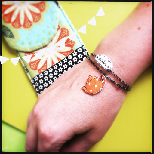
It's the one on the teapot.


2.Oil based sharpie permanent marker, sculpey glaze. It gives a fun shiny ceramic look.

it's the one on the cloud


That's it! I tried dozens of  tools and finishes and had a lot of fail. But the good results are really pretty.


Please use my tutorial but not my illustrations if you want to sell and make your own jewelry. Make your own tests before giving or selling as I can't vouch for  constant results. 


Saturday
Feb232013

maternelles - kindergarten

My son is in kindergarden this year and I am allowed to drop by in his classroom form time to time to share paper toys ( and some fun) with his friends. 

Last time was about tiny houses. I brought this model to them and we fold it together. With the help of their two wonderful teachers, 19 friends managed to do it in record time, hurray for kindergarten!

Find here a pdf with other houses on the same model

Get here my book with sturdier and prettier models.


Ici les mamans sont autorisés, et même vivement encouragées à participer à la vie de l'école. Genre, tu as un budget et de bons profs, ou des parents,  les deux, ou pas du tout. Nous avons la chance d'une bonne école et de bons parents.

Je passe de temps en temps dans la classe de mon fils pour leur montrer comment apprendre ( sans s'en rendre compte) la géométrie avec deux bouts de papier et des ciseaux.

La dernière fois nous avons fait les maisons de mon enfance, celles que je faisais avec ma maman.  Voila en Anglais les instructions pour faire vous aussi (encore une fois). Je suis ravie, les 19 petits bouts, avec l'aide de leur professeurs, y sont parvenus en moins d'un quart d'heure!

Vous trouverez sur Vimeo un tutoriel video en Français pour faire la maison avec un carré de papier. 


tuto Maison from delphine doreau on Vimeo.

Monday
Jan282013

Put the friends back into Facebook

With two cultures and two countries I love , Facebook is an important tool to me. I use it to follow people I love, friends I care, and website and groups I like. I have a page for the Non Dairy blog friends  , and a private page for my close friends and family only . I am cnot a social butterfly, and enjoy on this platform the cosiness of village sharing.

Cosiness which I found more difficult to enjoy these days: Facebook was giving me more and more advertising, highlighted pages I don't care much for (but the companies paid to be highlighted) and got less and less news about the ones I really care for (like the Chouettekits page) My friends were lost in the mess, and it felt exactly like when you listen to the radio and there is more advertising than music. Not my cup of tea. 

So I looked closely at the problem, and discovered that the fact that I "friended" someone or even considered him or her as a "close friend" didn't mean I would get all the updates. Same thing with the pages. If you like a page, unless the owner pay for it, you won't get much updates. And of course, the interesting ones are not the one who can pay for it (including me).

 So what can I do ? Well, I can be proactive about it. I went to ALL my close friends pages, and ALL the pages I really like , and did this:

1.Go on the friend home page or "liked" page of choice

2.Find and click on the "friend" or "like" button (it's under the page banner) and
click on the "get Notifications" link.

Like this:

Do that for all your friends and all the pages you really like (don't forget mine!)
For an even more cosy experience, I made a list of my favorite girlfriends to make sure I won't miss anything. 

Et voilà.

Back to the village. I still have a little advertising, but it's not the bulk of my Facebook experience, and it feels so much better! I hope this will help you enjoy Facebook a bit more.  

Sunday
Aug262012

On colors (4)

Find the whole series "On colors" here.

While the others posts of these series about colors were about how I studied colors, this one is about a quick fix I found to build palettes for illustrations. 

I don't have always the time to study whole cultures, history of art, or even fashion magazines. Thankfully, there is this new trend on the internet that I find fab.  
Colors  and palettes are now fashionable , yeah for design blogs!

A designer will take a picture he likes, analyze the color platte, and republish it with the colors on the bottom or side. While doing this poses a few copyrights problems ( proper authorizing is indeed needed), it's a gold mine for other designers.


Here I made an example from one of my pictures on my other blog "Spilt Milk", where I post my photos. It's one of the cute houses from my book "Mon Village", isn't it cute?


Anyway. So for me, thanks to these websites it's like 75% of the color job is done. It's glorious. I will browse design websites, make mood boards, study the new trends ,and make my own palettes out of it. 

You can find fabulous palettes on different websites, but my favorite includes:

Creature Comfort : the chicest.  Ez Pudewa has great taste, and her blog is an inspirational paradise.

Color Collective : a trendy designer resource. Lots of good ideas and delicate colors.

Rotten Cupcakes: I love that author July Mack included a notion of proportion in her palettes. 

Design Seed: the gigantic corpus of this website is searchable with RGB cursors. An amazing tool when you want to build palettes around this specific lime green or that adorable coral.


I don't take one palette and use it as is. Like I said, most of my illustrations have a palette of more than 4 or 5 colors. What I do is gather palettes that go together on a mood board. Finding 2 palettes that goes together is easy, 3 more difficult, finding  6 assorted palettes a real job. I gathered up to 14 to make a rich color panel. I combine them with old favorites that constitute a big part of my personal style, to bring a richer world of colors in my illustrations.

And then comes the hard work : painting!

Next time I will talk about fun apps and tools to create your own palettes.


Tuesday
Aug212012

On Colors (3)

Find the whole series "On colors" here.

Here is how I began to study colors with my very own approach. I needed something more practical than rules defined by others for other uses than mine. I needed to find the equivalent of mixing colors on a palette, and to go through my own culture and gathered corpus of lovely picture.

I took my iPad , and a few color apps. I used successfully Palettes Pro and Adobe® Color Lava for Photoshop® and tested some others ...I liked Palette Pro because it can extract colors from a picture, and Color Lava is fun because I can use the colors in Photoshop via Wifi. It's not really practical but real fun in a happy geeky way.

So what I did first is take my favorite pictures ever and extract the colors I loved.

Here is a lovely illustration by Boutet de Monvel on Adobe Color Lava. Boutet de Monvel was a very well known French children illustrator in the first part of the 20th century. I love his pictures since I was a little girl. So it was a good place to start! 
For months I analyzed loved pictures and discovered two important things:

1.That 5 colors is enough to make a picture, but usually not enough. Most of my illustrations have more than 5 colors . I had to combine palettes or add colors.


2. That color analysis app are great tools, but they don't give you the proportions to use. Like, if there is a large amount of red in a picture and very little blue and yellow, you will still extract samples the same size. I don't find  it helps me choosing colors. I learned to make moodboards instead of palettes, so I could get the inspiration I needed. Colors is about proportions, contrast and accents. Pinterest is a great tool for color hunting : see what I gathered here.

I also used the application moodboards on my iPad. 
Here is a sample I made for you, so you can get an idea : of course I don't use my own pictures usually.


Because colors depend on language a lot I also made research on color names in both my languages : corail, Kelly green, puce...I also learned that translation doesn't work so well: Khaki is not the same color in French and English. I began to translate colors in different languages to google them and get even more ideas.

This is how I learned more about colors and how I use them my way. But that's a lot of work and studying. I understand more and I am able to understand even more by association. It was a long and pleasant way and I am still working on it. Learning teaches you to be curious and make your own conclusions, and in a world of preprocessed foods and informations it's a very good thing. 

But I also came up with a good, fast way to create interesting palettes, and I will tell you more about it next time!


Tuesday
Aug212012

On colors (2)

Find the whole series "On colors" here.

I studied colors for a long time. Working on forensic reconstruction of the face of Ramses the Second, I learned how Egyptians used colors  3 thousand years ago. I was intrigued because they used two set of colors : one, very restricted, for sacred stuff, and an expanded one, where they mixed colors , for more casual pictures. (follow links for pictures)

I also knew that parietal paintings found in Lascaux had mostly four colors : white red earth and black. I don't think it's because they didn't have any other colors. I think it was mostly because of symbolic meanings. The same kind of meanings you will find in medieval pictures, in pojagi or ukiyo-e. The system of colors we use for road signals and logos are still respecting the medieval rules of colors created for coat of arms. Colors are deeply embed in our culture.

It is easy to get on the other side of the color perception and consider only symbols. Meanings and symbols generated glorious and simple, beautiful pictures. You can drape yourself in color meanings and enjoy it tremendously.

Clutched between science and symbols, Goethe and Newton make me quite nervous. Their work on color is the basis of most that we know now, but both of their work is tainted with approximation and affirmations with no scientific basis whatsoever.   

I studied  for a long time. I also studied the fact that we don't really see or integrate a color before  we have a name for it. Like there is very little quotes of about blue in Occident literature before the 13th century, when suddenly blue became a very trendy color indeed.  We ourselves thrive by trends, and words like turquoise, tangerine , coral and the multiple names of browns bring different palettes to our lives. Language is actually a big part of our color world.

Studying gave me only one certitude : there is scientific rules for color production...But there is none for color use. Unless you consider the part of art that is giving yourself rules about what you are doing ( ex: I will do this in a square. I will use bright colors. I will use only crayons...etc) there is absolutely no rules. There is taste. There is culture. There is fashion. That's it. You can follow, or not : you are free.

Pick something you like. Work with colors you love. Chose your own rules. And break them too.

I remember that brown and navy blue together were out of question for me. I mix them happily now. I wouldn't squirm on an orange and khaki and pink picture now, but 20 years ago I would have found that disgusting. And I would be sorely disappointed now by the colors of my living room in 1992 : cream, grey-blue and pine wood, which I used to love to bits. 

So I took another approach.

(to be continued)

Saturday
Aug182012

On Colors

Find the whole series "On colors" here.

My dear  friend Lisa was wondering the other day how I chose my colors. She knows I am very much interested in the subject. From science to perception to language, sociology, and culture, it's not a light subject.

Most people are very happy with complementary colors...And are half wrong because they don't use the right color wheel.  Like, in the real world of perception, the complementary of blue is yellow, and red is turquoise. But whatever, because what is important is actually contrast and similar shades .


And then there is fashion (yes indeed for colors) and cultures . For example red is GOP here, socialist in France, and people live by the colors of their flags wherever they are. Except in Holland were they have another national color, orange...In bright lights like in LA people tend to like more vivid colors, in softer ones more subdued , like all shades of plums and grey in Paris , so you can't really define rules. Or you can define ones but they are very complicated. 


My grandmother Mamette explained me once a little trick : you put all your colors in a rainbow , chose 3 or more that stand close to each other, then one at the other side of the rainbow for accents. It always works. 

I do follow her advice . Then I added cultural palettes I met in my travels  and studies: the palette of the little pink  Battistero in Parma , red and pink combo seen in Japanese chiyogami, mix of yellow and fuchsia seen in Goa, the particularly delightful celadon green of the Pacific here when the sun backlit the waves...that kind of things. I created my very own palette, with my favorite blues, reds and greens, that worked together. It took me years!

But I realized recently that even if these were my favorite colors, and even if Mamette rules...I was still using the same colors, always . So I added colors from people I love : that lavender from Clo, this mustard yellow from Rachel, a bit of bright blue from my husband, green from my son...It's fun to think about them when I paint, but it's not enough, it's never enough.

So I took another step... I will post about it soon!


Pas de traduction...La dernière fois que j'ai posté à propos de couleurs, j'ai eu droit à plein de remarques très désagréables de la part de trolls Franchouillons qui ne savent pas que Newton a choisi 7 couleurs dans l'arc en ciel pour des raisons ésotériques ( c'est pas très scientifique ça), que Chevreul voulait surtout créer des teintes pour colorer du fil, que Itten est complètement dépassé et que la couleur est un problème de culture et de langage autant que de science. Si vous tenez absolument à expliquer à toute la planète que le vert est la complémentaire du rouge parceque c'est trop dur de remettre en question des règles difficilement acquises...Abstenez-vous de commenter et je ne sais pas moi...Allez regarder un feu rouge, fermez les yeux...Quelle couleur apparait?